UX Copy, IVR copy/VO and Banner Campaign: surrounding the user in messages of care
Blue Cross Blue Shield of Florida’s The Power Of the Human Voice (POTHV) campaign debuted April 2008 and was one of my more fascinating professional experiences. Working with talented designers, IAs, creative directors and programmers, I helped DraftFCB create a living audio message board for Blue Cross and Blue Shield of Florida members and other Florida residents to broadcast their views on healthcare.
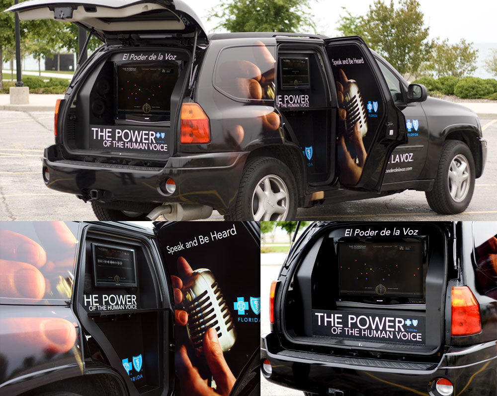
Blue Cross and Blue Shield of Florida’s powerofthehumanvoice.com website was the hub of the Power of the Human Voice initiative, supported through web, TV, print and OOH events. The campaign was created to encourage residents of Florida to tell their stories and share their ideas on how health care in America could be improved. The site allowed visitors to leave a message via their computer’s microphone or by calling an 800 number that was connected to the user’s session. In addition to the website, a stand-alone kiosk version of the site was created for use at out-of-home events across the state.
DraftFCB’s POTHV Campaign Video
Here’s a nice overview video from DraftFCB which points out that the whole campaign actually drove to web – highly unusual for the time. (The video’s a little heavy on the follow-on TV, but it’s a video, so… Also, those super-dramatic Floridians are actually actors from Buenos Aires.)
I was responsible for the user experience copy for the POTHV site; the interactive voice response prompt copy, voiceover and production for those calling the 800 number to share their thoughts; and several banner campaigns: a straight messaging campaign, an embedded microsite campaign that allowed browsing of recorded ideas (including a widget for Facebook) and a sustaining campaign that built on the feedback BCBSF was receiving through the site.
I’m able to share the simpler banners here, converted from Flash to video; unfortunately the captivating interactive banner campaign doesn’t work at all now that the POTHV site is long gone.
Messaging Banners
Sustaining Banners
Website UX Copy
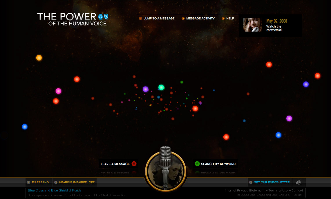
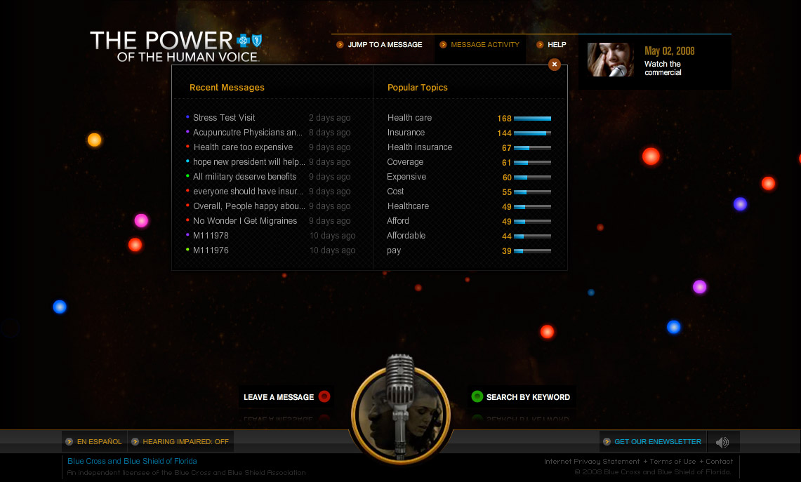
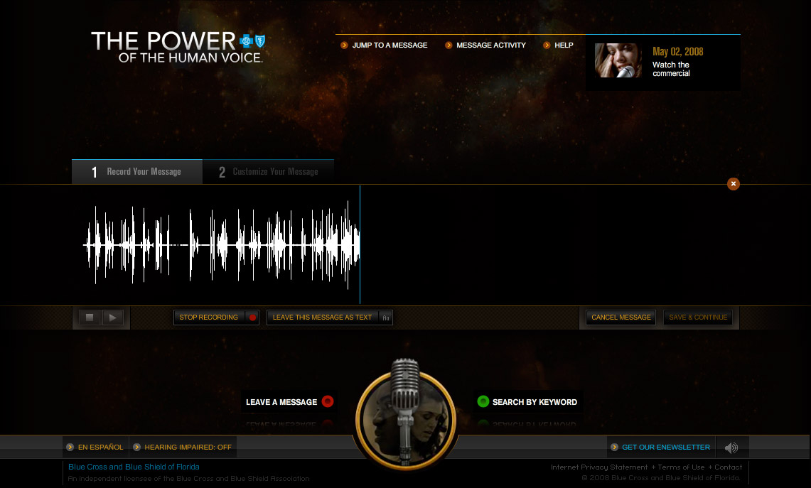
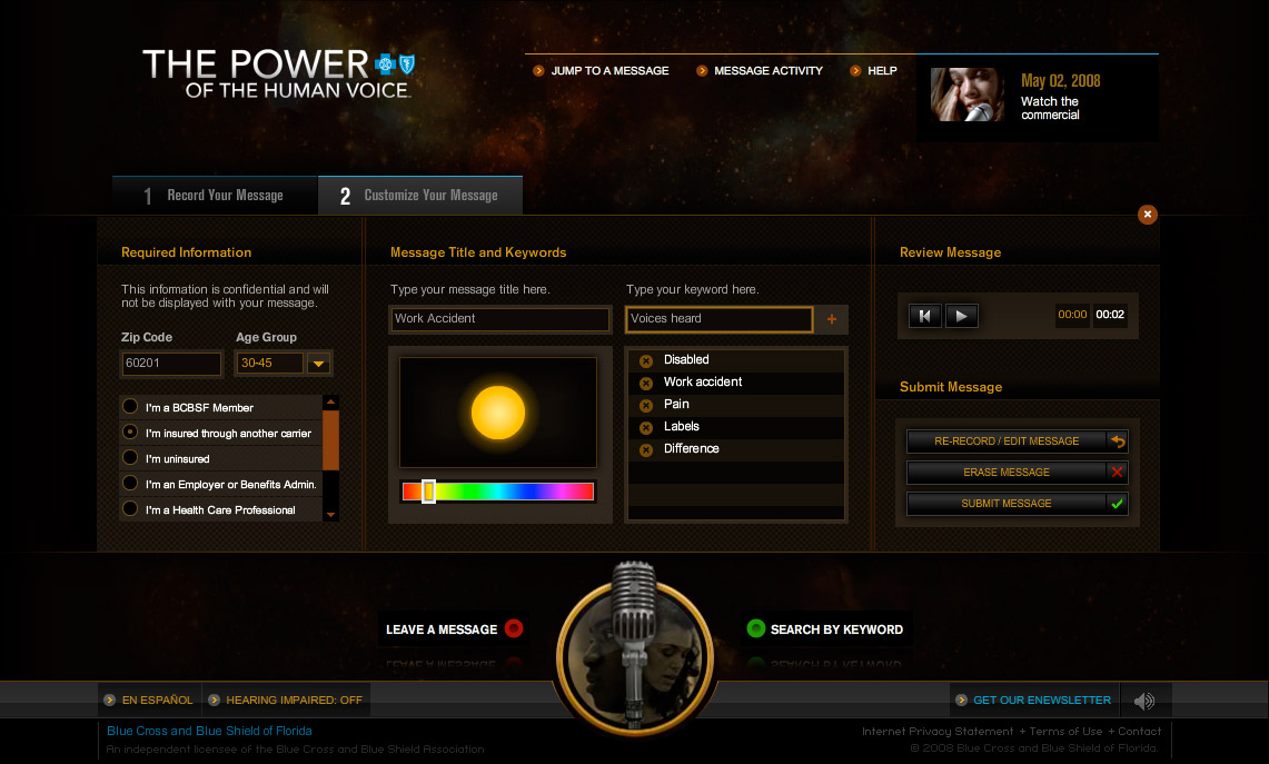
The web experience is like flying through a field of pulsing stars, each one a voice, and hearing them approach and recede; when you click on one, you can listen to that message and read a transcript. It was a conversation, as well, since BCBSF used it to post messages to their customers (marked with the Blue Cross.) Some of my UX copy is visible in the following screenshots, but I failed to capture whole areas like the instructions and FAQs. Mea culpa.
Finally, the OOH vehicle for POTHV events:
