NUEDEXTA content, UX copy, collateral: straightforward and sympathetic to reach the PBA community
We were briefed just after the turn of the year 2018 on NUEDEXTA, for the condition called PseudoBulbar Affect, with a timeline for campaign launch (tied to new print and a TV spot) that was aggressive.
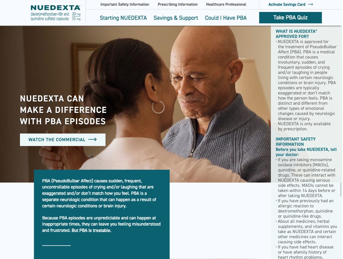
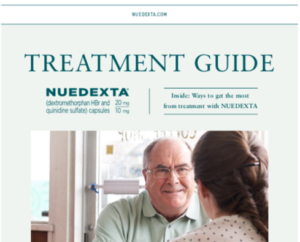
Here I’m presenting only one piece and a download to represent my main account for about fifteen months, but I encourage you to click through to NUEDEXTA.com for UX and content copywriting.
Alongside the development of this website, I wrote a CRM email stream, a digital wallboard, a series of banners, a site takeover, two direct mail pieces, and corporate launch promo items, participated in campaign ideation, provided support on print ads and the patient brochure, and presented a few ideas at the annual Brand Planning partner agency meeting. I also discovered a talent for making solid rewrites happen in live MLR sessions.
The site has developed through four or five major phases, depending on who’s counting.
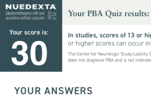
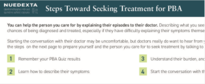
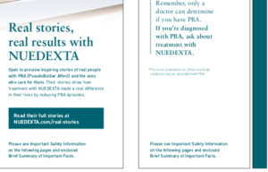
NUEDEXTA.com is still live with this design, so these screenshots are for your convenience.


