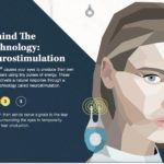
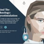
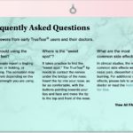
TrueTear website UX copy, messaging: unorthodox approach for an unorthodox treatment
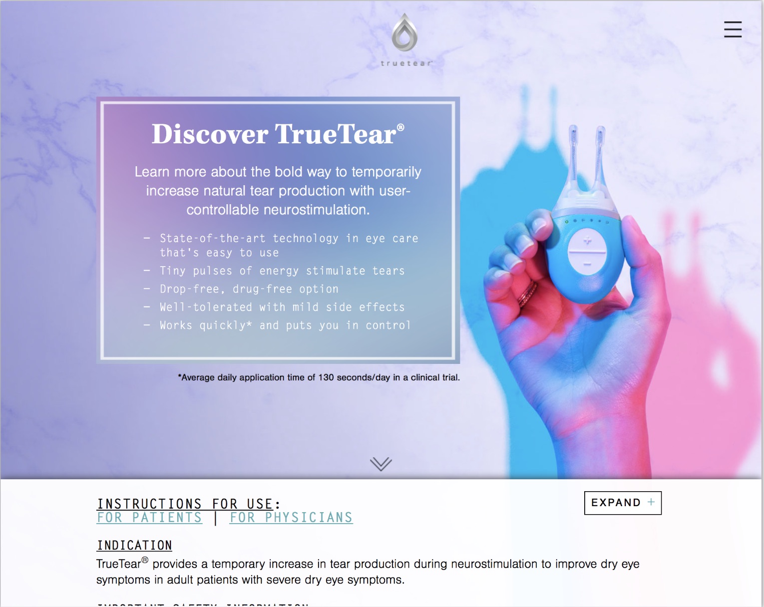
My first assignment in healthcare at FCB was the accelerated development for a website for TrueTear, Allergan’s novel nasal neurostimulation device for dry eye. Many caveats:
- TrueTear was indicated “for increased tear production,” not specifically dry eye
- the site was briefed as a sort of standalone digital sales aid that would only be seen on tablet or desktop in a doctor’s office, and was then retargeted as a consumer-facing site that naturally had to be mobile-first
- the timeline was so tight that myself and two freelance art directors went from brief to five site concepts in about three days
- Site development was a testbed for messaging, so every round of MLR review produced major changes
- TrueTear is unique but the idea of a neurostimulator that works inside the nose is a challenge for many potential users
- As a discretionary device, not covered by insurance it could be construed as a luxury, so our design cues leaned heavily on fashion references
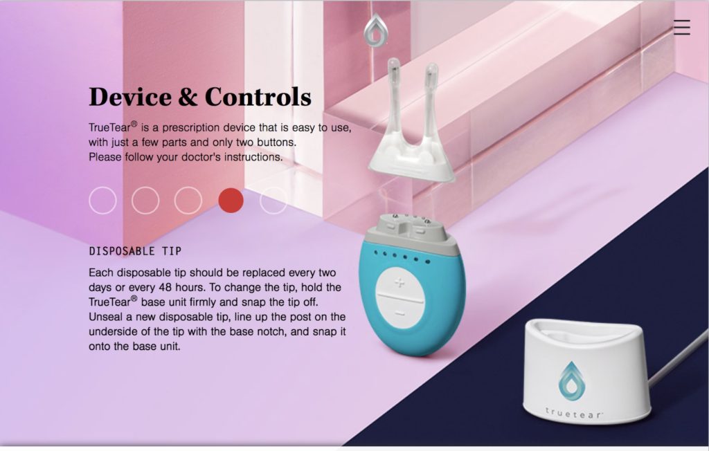
Projects such as this are almost like palimpsests, where previous decisions are never entirely scraped away but show through in the results. There’s much of that here: the locking-pane long-scroll format is definitely tablet-first; the homepage hero layout was not mobile-friendly at all, worse once the ISI was layered on top; the demonstration video seems like it’s from another world (it was: it’s a more straightforward replacement for the original promotional video, which featured two young TrueTear users and employs a lot of smart tricks to make a dry eye treatment seem fun.)
The only updates to this site since it went live in 2017 were minor technical and product detail changes. Even when the FDA granted an indication that finally mentioned dry eye in 2018, the label update we made barely touched the copy. We went on to develop the TrueTear Pro doctor portal as well, also on this portfolio, but Allergan has folded the TrueTear business.


